Film Opening Sequence

Evaluation: Question seven


This is my prelim task. Bearing in mind we had had close to no practice with the programmes and cameras we used to make this film opening i actually think it went quite well. The acting could be improved a lot but we had never tried to act for a film opening before so that couldn't really be helped. 


I feel i have learnt alot when filming and editing as my prelim task was only average compared to how well our editing and filming was for our final film opening sequence for Parallel. I definitely think doing our prelim task was worthwhile as it helped us practice using the different editing tools and programmes which then resulted in our final film opening being successful. I learnt how to improve the titles which also then improves the quality of the film. 


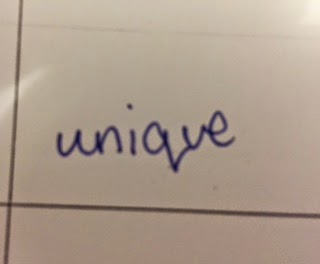
This is my prelim task title. I hadn't used Premiere before so i didn't really experiment however i didn't think it was too bad for my first film opening.


This was our final title for our film opening sequence. After our first draft we changed the titles quite a lot as our class feedback mentioned a lot about titles and how they didn't work very well. We chose this font and size for our final draft and everyone seems to think they work well with the genre of our film and we are also happy with them as a group.

My learning journey is evident throughout my blog. It is obvious that i didn't know much about how to use each programme to create the film openings/ practice edits hence why they aren't as successful as they could be. However looking at my more recent blog posts it is clear that I have learnt to use and experiment with a few different/ new programmes such as E-Maze. I found this programme quite fun to use as it was different and made my 'audience research have also learnt a lot about different films and how each aspect of the film is important in its own way. For example the titles. I didn't think titles were that important so we spent less time on them and concentrated more on the filming side of things. We soon came to realise (after receiving our class feedback on our first draft) how important titles were when it comes to introducing a film.  


Here is a screenshot showing a part of my blog that shows one programme used to prove  my learning journey is evident and how it has improved. 

When taking camera work into consideration I think I had included quite a few varied shots into my prelim task such as match on action. This was shown when Olivia opened the door to go into the toilets. I tried to make this as smooth as possible so each shot would dissolve and appear into the next, however I do think this could be better with more practice. In our final film opening we aimed to used all of the well known shots which would give us the best possible mark for our film. We used a birdseye shot when we filmed Max walking down the path in the park and I actually thought this worked really well and created quite a creative effect. We also used shot/ reverse shot to show Zac and Zabel talking to one another. This use of camera work created tension and suspense and also allowed the person viewing it to empathise with him as he was being controlled by his second personality.

 This shot shows the first part to the match on action as the door handle is pushed down and the door is opened.


This shot shows the after- match on action after we had walked through the door that had been filmed opening from the other side of the door.


I think this image is quite well shot as we managed to film ourselves in the mirror without the camera being seen which made it seem ore realistic and like a real film.

Here is the birdseye view of Max walking down the pathway which I think is one of our most successful shots.
 

Evaluation: Question six

Evaluation: Question five

Below is the link to our Questionnaire for our film Parallel, feel free to give some constructive feedback.

https://www.surveymonkey.com/s/MSLNJZ2

We got a lot of interesting, constructive feedback from our focus group and from people who answered our questionnaire. This helps us determine the good and bad parts about our film, making our evaluation better.

We got a lot of helpful feedback.

A lot of people said that they would pay to watch our film in a cinema which is ultimately the most important feature of a film as at the end of the day it is a business. This also makes us confident that we have created a film that can realistically be made into a real movie.

Most people felt the film kept their interest going. Although some people said no which we think could be down to the walking scene as it did go on for a while.

A lot of people liked the cloning effect in the editing as it was different and more complex than most other media projects. This seems to be a popular advantage to our film
.

Evaluation: Question four


After finishing our film opening I have done some research into what types of people would be interested in our film. When we began planning our opening sequence we decided to have a few different ages as our target audience that would like different aspects of our film. However now the film is completely finished we have decided just to chose one age for our audience research. (18 year old boys) which we have decided that it would be most popular from an indie teenagers point of view. In this E-Maze I have researched where our target audience would shop, what kind of music they would like, what their favourite television programme would be etc.

Evaluation: Question three

This is a video explaining the types of institutions who may or would not produce/distribute our film.


Evaluation: Question two

In our media product we focused on various representations such as gender and age when it came to Zac. In this question, I have compared him to other characters similar to him but also explained how Zac does or does not follow or go against the typical representation.

GENDER: 

I have made a character profile of Zac to explain the typical representation of gender:


                                                                                                                                              This profile compares him to another, similar character - Simon James, and also explains 
why he goes against the typical representation of his gender.


AGE:

Typical representation of a boy of Zac's age: 


Some would be portrayed as going out to parties and being around their friends a lot. They could be seen as immature and to not be serious about much.

Zac goes against this representation of age as he doesn't appear to have many, if any, friends and is shown to live a very isolated lifestyle. 


Another representation of age is the 'geeky' type of boy. Not many boys pictured above would also be pictured studying in most media products. This shows a big contrast in two different representations of the same age group.

Zac supports this representation and goes against it at the same time as he looks like he is interested in academics as he is reading a book about psychology in the beginning of our film. He goes against it however as it is not clear that this is actually what he is doing, he is not shown to be at university.


An example of a representation in a real media product: 

This is a character, Lucas, from the television series Pretty Little Liars. Although this is not a film, it represents age in a similar way to our media product.

Lucas is portrayed as being geeky and shy, into school and extra-curricular activities such as the Yearbook club. He is shy and not good at confessing how he really feels.

This is similar to Zac as he is extremely shy and timid and will not readily talk to anyone else. This could show how he fits the 'geeky' representation of a young adult.  

This is Caleb, another character from Pretty Little Liars. In the series, Lucas sees Caleb as an enemy due to them liking the same girl.

Caleb is manly, handsome and often gets himself into trouble. This is similar to the very first representation of age I described.

This is similar to Zac and Zabel as Zac sees Zabel as a threat to his freedom. This fits the representation of age that the more popular, mischievous boys are superior and more powerful than the geekier, more intelligent and shy characters.

Evaluation: Question one


 This is a Prezi with our nine shots and explanation of how they develop, challenge or conform to our genre.

CONVENTIONS:

 I did some research into the different conventions of indie films but also watched similar films to our own and looked at the types of things they included. I then compared my research with what I found with watching films and picked out the six main conventions that featured in both.

NARRATIVE:

This is an explanation of Torodov's Narrative Theory and in-depth explanation of our 'equilibrium'. There is also a picture from 'The Double' which is a film we used for inspiration. 

This is a comparison of Torodov's Narrative Theory using The Double and our media product, Parallel. As we couldn't fill in all the sections for the Theory, we included some ideas of the direction the film could take if we made the whole thing. 

This is another example of applying Narrative Theories to our media product with Barthes and Levi-Strauss. 

CHARACTERS:

Zac: He is supposed to be a young adult suffering from a mental illness. However, from his suit and calm attitude at the beginning, the audience probably wouldn't expect this, I think this conforms to the genre as in Indie films, the protagonist is not usually predictable. This shows in Shallow Grave as it is hard to work out how the characters are going to act.

Zabel: I would say that Zabel is quite stereotypical character as alter-ego's are rarely portrayed as helpful or even angelic like. This challenges the genre as I said before, the characters are not supposed to be stereotypical.


This is our example of our characters in Propp's Theory. As the story was not developed fully, we were unable to add many of the characters. However. this also conforms to the genre as independent films are supposed to have a small cast.

Final draft


This Is our final draft of our opening sequence Parallel. From our first draft we have made quite a few changes. We read our feedback and mostly made changes which were mentioned in our constructive criticism. For example, our titles in our first draft didn't look very successful so we decided to change the font and the size to improve the film opening. We changed the names as the names used in the first draft looked very unprofessional and cliché. Some of the footage we got didn't really add to our film so we cut it out. E.g the shop scene. Myself and Olivia spent some time fading different shots into the next to make the film flow and cutting out the irrelevant/ boring footage. When our peers were watching it they didn't really understand what was going on when Zac went into the shop. Also first of all we added to may shots of just walking which made it quite boring to watch so we removed those and added backing  music. The music we chose was by the Arctic Monkeys. We thought this song went well with our opening sequence and also makes a few of the shots less boring and the opening scene more interesting and engaging. We had some feedback from our teachers that our first draft was too long and dragged out a little bit too much hence why we cut quite a few of the boring scenes out. The sound on our first draft was almost too quiet to hear but when editing our film opening for the second time we increased the audio gain on the dialogue which has made the sound in our film a much better quality

Film poster

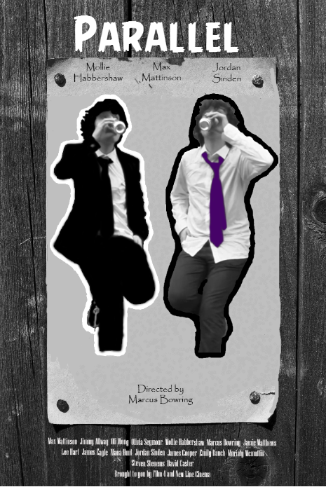
Parallel Film Poster

This is our film poster we made to represent our film 'Parallel'.

Possible music choices

I have been researching music choices for films similar to ours and have come up with a few ideas. I think the choices i have chosen would work well with our film and genre as they are all quite high pitched but also quite chilled out which matches part of the film opening.

Arrival of the birds Cinematic Orchestra


Time Inception


To Build a Home Cinematic Orchestra


Requiem for a dream 

Fonts and titles


This is a practice of our titles. Olivia researched titles on films that related to ours and found how each title was presented. She then tried the fonts and sizes out and made sure they worked for our film opening sequence. As a group we also thought they matched the genre of our film which would create a successful opening.

However after the class feedback we realised the fonts we had used didn't look very good and we took them for granted as we didn't actually think titles would be that important compared to the importance of the actual film opening. The titles we included were the wrong sizes and they also didn't last as long as they should have done. Everyone else in the class had also taken the titles for granted as no one realised how important they were throughout the film openings. Due to this, Olivia spent time changing them and using different sizes and styles to come out with the best possible outcome. We are now very happy with the fonts chosen and think they improve the opening sequence by a lot.


Class feedback from first draft

From watching our first draft of the film opening, we sort of had an idea of what needed to be changed or improved. The editing for our film took a long time due to the cloning effect we needed to clone Max into the two characters shown in the opening sequence. Because the editing took a long time the group didn't have much time to tidy up the rest so we decided to focus mainly on the tidying up of the opening once the first draft had been handed in ready for the final draft.

Once we had received our feedback we knew what the class thought we should change in order to make our film opening more successful. For example, we thought adding music would completely ruin the opening but after reading the class feedback we thought maybe we should consider adding it. Also, we were advised to cut some shots out to stop it being so boring, E.g the shop scene. If it wasn't for the feedback we probably would have kept it in there but we did in fact delete it. We also think now that scene has been deleted, it makes more sense.

Here are a few pictures of the class feedback:


A lot of the good feedback included the cloning effect we used for Max. We were also complimented on a few of our shots at the beginning of the opening. One popular shot from the class was when max enters the house and you just see the door from an angle, closing. I think Max did a really good job on the editing as the cloning looks very realistic and also Olivia's help with the tidying up of the final draft and putting it all together as a final opening sequence made it as good as it could be. Marcus chose the final song choice and it works really well with the filming. I think we have all done well all in all whether it involves the actual editing of the film or the paper work and research of different parts of the task.

We also had some criticisms alongside the good feedback. Most of these included the shaky shots and the lack of music which we have taken on board and tried to improve. 


Storyboard

Blog reflection

Technology:

As i have added more and more posts to my blog i have tried to vary the different programmes used so i can have a lot of practice which i think will be useful in future when deciding on which programmes will work best for certain tasks. Recently i have used SlideShare. This programme is for uploading powerpoints so they can be viewed via the blog. During our film opening planning we have used SlideShare quite a lot for some of our research. For example, audience research. For our prelim task i practiced using Prezi to show all the different aspects of our planning. i wasnt very keen on Prezi as i found it quite confusing to use and there was nothing to tell us how to use the programme. I have probably spent the most time using premiere throughout our filming tasks. the first couple of times we used it i found it very confusing and wasn't sure how to apply different effects for different parts of the footage. For our prelim task i spent a lot of time using premiere and i became more confident in using it and i liked my outcome. I particularly liked the ghosting effect.

Mark out of 20?

I would give my blog around 15/20. I need to include more pictures on my blog to make it easier when giving examples for each topic. E.g Representation. I also need to add more detail to certain parts to make my blog more interesting and in depth. I think i have completed tasks well and done what i have been asked to do, including my own knowledge.

More thorough or less complacent?

I reckon i could be more thorough with quite a few of my posts e.g Mise En Scene. There is a lot more i could write and i could also add some pictures for examples of what Mise En Scene actually is. I think this would make it more interesting for the person viewing my blog and it would also make a lot more sense to them. I don't think i've really been complacent as i have tried to fit in quite a lot to all my posts to make the topic quite obvious however i think it could be better if i added images to some of the less interesting posts.

Is it fun to look through?

I think my blog is fun to look through as i try to change the design and text quite often so it isn't boring and 'same' looking. I prefer the colour of my text to the original black text as i think it makes it more interesting to look at. I have also changed the text setting so the colour of the text changes as and when you hover over it and also once you have already visited a certain link. However i do think i need to add a few more pictures to my blog to make it stand our more and to make it more interesting. 

Learning journey 

The learning journey is evident as when i started posting on my blog you can see how little i knew about media and as i have been doing media for longer my posts have got more in depth and more detailed. If you look at my first practice edit using premiere compared to my prelim task, the difference is very noticeable and you can tell how far i have come with using different programmes. I have also improved on written posts and understand a lot more about the theories in media than i knew in the beginning.

Targets

To improve my blog i think i need to add more photos to make it more visual and interesting. I also think i need to keep practicing using premiere to get as good as i can be and make my videos as good as they can be. I should probably change the layout quite often to stop it being boring. 

Shooting schedule


This is our shooting schedule. This shows when we have planned to shoot our film opening. However our planned schedule could change due to the weather. We may have to extend the dates to film if the weather is bad or just swap round the days and we may have to use the weekend of the 29/ 30th to get all our filming needed, done for editing on Monday 1/ 12 at school.

Conventions

Here are some conventions which make our films genre clear:

Setting

Our film opening will be set in Admirals park. We think this is a good location as it isn't usually busy so there won't be any interruptions whilst we're filming. It is also very spacious which would create an eerie atmosphere to help with the genre. I think the fact that we will be filming outside in a park will also convey the genre as it will be foggy and quite grey which relates to the schizophrenic mans dark thoughts.

Themes

There are a few themes in our film opening. Duality is one which we have considered due to our character having schizophrenia. This is where binary opposition is also relevant, we see two sides of Zabel (Max); the good side and the bad side. One of our themes also includes sanity, whether our chosen character is sane or if he is crazy due to his mental illness. There is also the question of reality. What is real and what isn't...

Icons

The main icon in our film is the medicine bottle filled with pills (Tic-Tac's) to treat the schizophrenic character. Another icon Is the coke can in which Zac's second personality mentions in a dark joke.

Narrative

We have planned out our script for the film opening which we will then follow throughout filming. Max came up with the dark jokes to match the genre.

Characters

Max will play Zabel and Zac (schizophrenic character) and Liv will play the random woman that sits on the bench with him.

Textual Analysis 


Timeline of shots and film titles


Film pitch feedback


                                   https://blogger.googleusercontent.com/img/b/R29vZ2xl/AVvXsEhINoOvjSMO_yGXazjJGgS3mULH2suGa1vfbVHfb-ZpJ4LBAmSvdM_g6in2oOdxinjMahX6s7XmEJsWAyVTbqhnaYSk02hdJwfgMQ8JKqOaaVf7e0RiYDoWRPQRXYfZQjke3xaKRtJ3CAM/s1600/FullSizeRender%5B1%5D.jpg 


When we showed our film pitch to the class we got a lot of comments based around how they thought the editing ideas were good and how they would work quite well, before we even showed the pitch we had already thought the editing sides of things would be the most popular. Some of the comments also included how our group had worked together to come up with the idea, which, in the long run would make our filming process etc a lot easier as we were all in on the idea. We also had a lot of feedback on the confused genre. After the presentation we discussed this as a group and decided to change parts of the opening/ the name to make the genre more obvious and to stop people getting confused about it. We were also advised to make the target audience more specific rather then just stating ‘adults’. As a group we decided to only use two locations rather than three and to reduce the dialogue to give us more time to focus on the effects and the title edits etc. This will hopefully make our film opening make more sense and also better quality.

Script


This is our script for our opening sequence. Olivia and Max came up with the script by looking at other scripts and tried to do ours in a similar way. When we come to filming then it is obviously subject to change but we are very happy with it. We know that it is quite dialogue heavy but we plan on re-dubbing most of the talking to make it sound as clear as possible.


Risk Assessment


This is our risk assessment for our film, Parallel. Most of the risks are minimal however it is important that we recognise risks that COULD happen so we know how to keep ourselves safe.

Synopsis Planning

What we will need:

  • A bench in Admirals Park
  • Bus stop. (Preferably not in use by other people) 
  • Trees in the park
  • Pavement beneath the bench
  • Suit 
  • Smart shoes and bag/briefcase
  • Medicine bottle and new label 
  • Tic Tacs  
  • Coke and Diet Coke 
Characters:

Max will play both schizophrenic men on the bench as it will be a clone. Olivia will play an unfortunate woman who happens to engage eye contact with Zabel/ Zac (Max) on the bench in Admirals Park.

Costume:

We have decided to have Max in a suit so he looks like an average working man but when the film starts, the problems start to unfold and it becomes clear that he has schizophrenia.  

Location: 

Our film opening will be located in Admirals Park. We will use the bus stop opposite the park on Rainsford Road, depending on how much filming we can get done and if we stick to the shooting schedule. 

Audience: 

We have pitched our audience to be between the ages of 18-30 however not excluding any ages older than that. We didn't think anyone younger than 18 would enjoy or understand our film which is why we set the age to 18. The certificate is 12A.

Mise En Scene


Mise En Scene


- Settings & Props- Costume, Hair & Make Up
- Facial Expressions & Body Language
- Lighting & Colour
- Positioning of Characters

As our film sequence is all outdoors, this makes finding a location a lot easier. We plan to film in Admirals Park. We were thinking about other parks but we decided that this one was ideal as it is quite big and picturesque but also close to a bus stop which is another part of our setting.
Our costume is also quite simple as well as there is only one character on one day so we only require one costume. We decided that the man (Zac) should be wearing a smart suit, nearly immaculate as he is supposed to be boring and plain. Whereas Zabel, the other personality, will be wearing the same suit but messy to represent his evil character. The costume of the other woman will be smart/casual, perhaps she is on a lunch break.

Facial expressions will be important in our sequence as Zac is supposed to be angry/frustrated/embarrassed quite a lot. Facial expressions will also be important when Zac finally caves in and shouts at Zabel, after which the woman sitting next to him quite obviously thinks he is talking to himself.

Although lighting is quite hard when we have a limited amount of time to film, we are going to try our hardest to get it all in the day time when the camera quality will be the best. This is also because we are trying to represent everyday life.

The main focus of the sequence is Zac so he will be on camera the most. It should be clear that he is the protagonist as he is the first person to come on screen and the main focus on the first couple of minutes is him.

Institutions Task

Film Four


Film Four is a British film institution company that is owned and operated by Channel 4 Television Corporation and it has screened many films. It has also distributed many successful films such as Casino Royal, Slumdog Millionaire, Shaun of the Dead, The Double and Shallow Grave. These are the two films that have been inspiring us for our film opening.  Film 4 has a niche, mature audiences which we intend to aim our film at. The main reason we decided to use Film 4 as our distributor is because we have modeled our film around The Double and Shallow Grave which were both produced/ distributed by Film 4. This means that they have experience in similar films to ours which helps things like marketing.


 New Line Cinema
 Founded: 1967
New Line produced the Oscar Award-Winning The Lord of the Rings film trilogy. Some others of its most popular films include The Mask, The Austin Powers titles, Hairspray, Rush Hour, Elf, Sex and the City and Wedding Crashers. Since 2008 (when it became a unit of Warner Bros) the company has seen the most successful period in its history.
Like Film 4, New Line Cinema aims its films at a more of a sophisticated audience. This is one of the reasons we want New Line Cinema to help produce and distribute our film. It can help us greatly in advertising to the right audience. Also because of its success it will help us advertise on a large scale.


Shot List

During our film sequence we want to include a variety of different shots to make it more interesting for the audience. Here is a rough idea of the types of shots we want to include, in order of how we want them to appear in the opening...

1. High panning shot of trees in Admirals Park
2. Wormseye shot of river
3. Extreme long shot of the park (play area)
4. Close up of the roundabout spinning on its own
5. Close up, wormseye shot of the mans leg
6. Pan upwards to reveal the man sitting on a bench
7. Mid-shot that tilts upwards to reveal both personalities sitting on the beach
8. Close up of mans mouth
9. Long shot of both men sitting on the bench
10. 180 degree shot during conversations
11. A variety of tracking shots including close ups and long shots whilst the man is walking to the bus stop
12. Long shot from across the street

Each shot will be accompanied with dialogue, music and titles.

Group Planning


These images show our group working together whilst planning the film. We were trying to figure out which shots would work best for each part of the opening.


Audience Research


This is our audience research. This shows various ages of people we think may be interested in our film and it also shows a child, who would not be interested in our film. We have given reasons as to why they wouldn't enjoy it.

Titles Task


 Titles task

The Conjuring


T1: Starts 00:17 lasts 4 seconds

T2: Starts 00:24 lasts 3 seconds


T3: Starts 00:28 lasts 4 seconds


T4: Starts 00:34 lasts 3 seconds


T5: Starts 00:37 lasts 4 seconds


T6: Starts 00:44 lasts 3 seconds


T7: Starts 00:48 lasts 4 seconds


T8: Starts 1:14 lasts 4 seconds


T9: Starts 1:18 lasts 5 seconds


T10: Starts 1:24 lasts 5 seconds


T11: Starts 1:29 lasts 5 seconds


T12: Starts 1:35 lasts 4 seconds


T13: Starts 1:39 lasts 4 seconds


T14: Starts 1:45 lasts 3 seconds


T15: Starts 1:49 lasts 4 seconds


T16: Starts 1:56 lasts 4 seconds


Pyscho (1998)


T1: Starts 00:06 lasts 6 seconds


T2: Starts 00:12 lasts 7 seconds


T3: Starts 00:21 lasts 3 seconds


T4: Starts 00:25 lasts 2 seconds


T5: Starts 00:29 lasts 2 seconds


T6: Starts 00:33 lasts 3 seconds


T7: Starts 00:39 lasts 6 seconds


T8: Starts 00:46 lasts 6 seconds


T9: Starts 00:52 lasts 3 seconds


T10: Starts 00:57 lasts 3 seconds


T11: Starts 1:02 lasts 3 seconds


T12: Starts 1:07 lasts 2 seconds


T13: Starts 1:12 lasts 2 seconds


T14: Starts 1:15 lasts 5 seconds


T15: Starts 1:22 lasts 3 seconds


T16: Starts 1:25 lasts 2 seconds


T17: Starts 1:31 lasts 4 seconds


T18: Starts 1:36 lasts 4 seconds


T19: Starts 1:41 lasts 7 seconds